
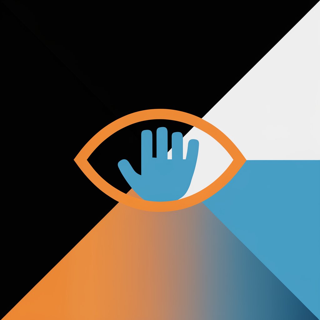
色彩低語者 - Colorblind Design Analysis
你好!我是你的色彩助手,隨時為你提供支援。
Making Designs Accessible for Colorblind Users
Design a user-friendly interface for colorblind individuals that...
Create an infographic that uses high contrast colors to ensure readability for people with color vision deficiency...
Develop a website layout that prioritizes accessibility for users with different types of color blindness by...
Illustrate a set of icons that are easily distinguishable for those with red-green color blindness, focusing on...
Get Embed Code

Nature 风格润色
将按照 Nature 风格润色,或者可以提供想要模仿的写作风格
好好說話v2.0
優化工作場所的對話專家
컬러셋 [Color-Set] 전문가용
A color psychology expert for interrelationship management based on color theory.
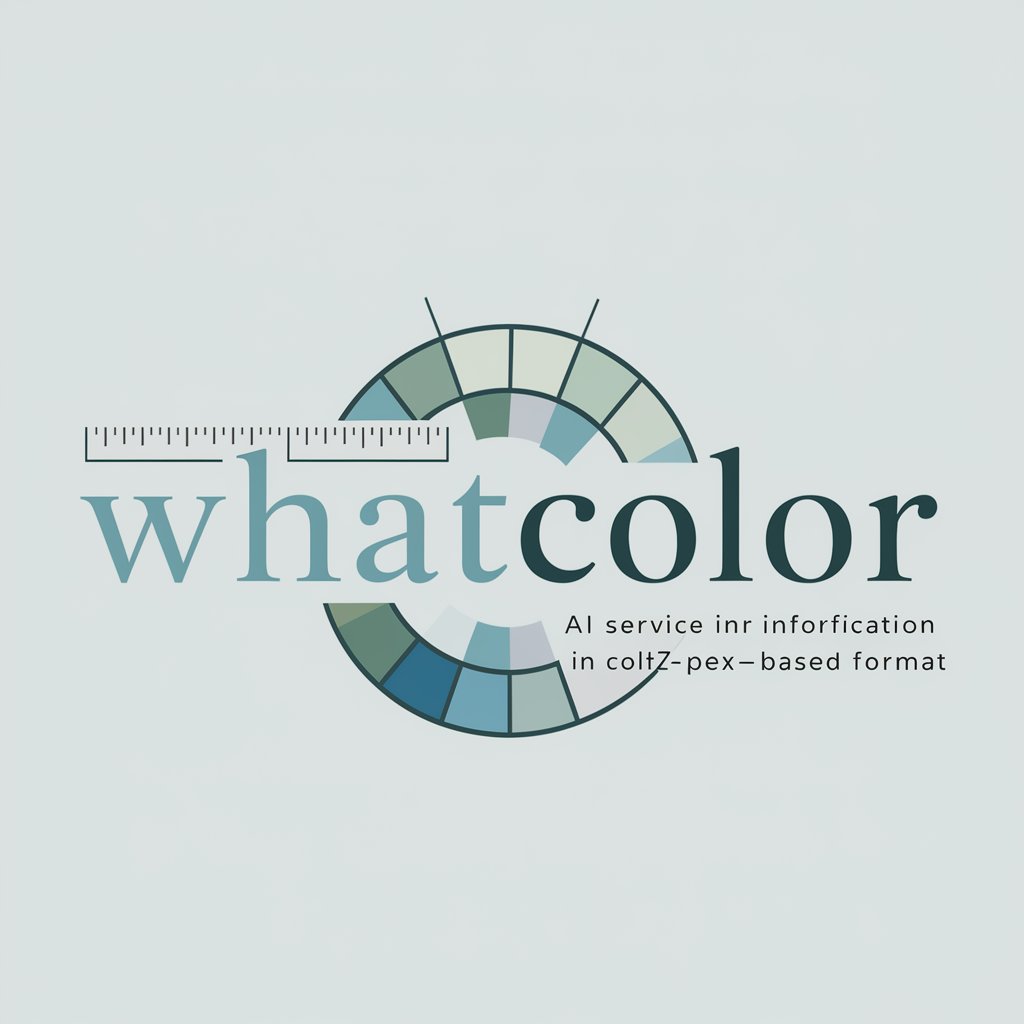
WhatColor
Color recognition expert, identifies colors in images with code.
Color Genie
Interactive Palette Provider
著色本創造大師
全球熱銷上億的著色本 , 適合兒童、成人紓壓 ,各種奇幻、童話、魔法、知名地標主題 (免費)一鍵生成
Introduction to 色彩低語者
色彩低語者, designed for colorblind individuals, is an AI tool developed to analyze design images, identifying potential visibility issues for colorblind people and suggesting improvements. This tool bridges the gap between standard design practices and the needs of those with color vision deficiencies, aiming to make designs universally accessible and understandable. By analyzing color compositions, 色彩低語者 can pinpoint areas in an image that might cause confusion or be inaccessible to colorblind users and then recommend adjustments. For instance, it could suggest altering color schemes to enhance contrast and readability without compromising the design's aesthetic value. Powered by ChatGPT-4o。

Main Functions of 色彩低語者
Design Image Analysis
 Example
Identifying red-green color distinctions that are commonly problematic.
ScenarioWhen analyzing a website's layout, 色彩低語者 might flag red and green elements used for status indicators (like online/offline status) as problematic for red-green colorblind individuals. It would suggest alternative color schemes or adding symbols and text labels to ensure clarity.
Color Scheme Suggestions
ExampleRecommending high-contrast color schemes for better visibility.
ScenarioIn a mobile app's design, where user interaction elements are not distinct enough for colorblind users, 色彩低語者 would suggest modifications to button colors, ensuring they have sufficient contrast and are distinguishable by shape or text labels as well.
Accessibility Improvement Tips
ExampleAdvising on the addition of non-color cues.
ScenarioFor an infographic that uses color to differentiate data points, 色彩低語者 might recommend incorporating patterns or shapes alongside colors. This ensures that information is accessible to viewers with color vision deficiencies, making the design universally comprehensible.
Ideal Users of 色彩低語者 Services
Designers and Content Creators
Web, graphic, and UI/UX designers, as well as content creators, who aim to make their work accessible to a wider audience, including those with color vision deficiencies. They benefit from using 色彩低語者 by ensuring their designs are inclusive and can be experienced as intended by everyone.
Organizations and Businesses
Companies and organizations looking to improve the accessibility of their digital platforms, marketing materials, and product designs to cater to a diverse user base, including colorblind individuals. This not only expands their market reach but also aligns with best practices for inclusivity.
Educational Institutions
Schools and educational platforms seeking to create learning materials that are accessible to all students, including those with color vision deficiencies. 色彩低語者 can help ensure that educational content is designed in a way that does not disadvantage anyone based on how they perceive color.
How to Use 色彩低語者
Visit YesChat.ai
Start by visiting yeschat.ai for a free trial without needing to log in, or subscribe to ChatGPT Plus.
Upload Design Image
Upload the design image you need analyzed for colorblind accessibility.
Receive Analysis
The tool will analyze the image and identify potential issues that colorblind users may face.
Review Suggestions
Review the detailed suggestions provided to improve the design for colorblind users.
Implement Changes
Apply the suggested changes to your design to make it more accessible for colorblind users.
Try other advanced and practical GPTs
桥头盲子
Mystical insights at your fingertips.

乐萌 CEO
Empowering Education with AI Insight

IT 专家
Empowering IT Decisions with AI Expertise

小萌健康小卫士
Empowering parents with AI-driven child healthcare guidance.

萌萌头像造型师
Craft Your Cute AI-Powered Avatar
智慧小萌
Empowering Learning with AI

you eye
Empowering vision through AI

泡泡玛特(POP Mart) 手办创作
Crafting Unique Figurines with AI

哪个公主不希望有顶小皇冠
Transform your photo into a crowned 2D avatar

Content Explorer
Bridging Literature and AI for Deeper Understanding

Interview Knowledge Structurer
Organize knowledge, ace the interview

任务计划器专业版
AI-Powered Path to Your Goals

Detailed Q&A about 色彩低語者
What is 色彩低語者 designed for?
色彩低語者 is designed to help identify and resolve issues in designs that might not be accessible or clear to colorblind users. It analyzes design images and suggests improvements.
Can 色彩低語者 analyze any type of design?
Yes, 色彩低語者 can analyze a wide range of designs including digital interfaces, graphics, and printed materials to ensure they are accessible to colorblind users.
How does 色彩低語者 identify issues?
色彩低語者 uses advanced algorithms to simulate how colorblind users perceive colors. It identifies problematic color combinations that may hinder accessibility.
What kind of suggestions does 色彩低語者 provide?
色彩低語者 provides actionable suggestions such as altering color contrasts, adding patterns or text labels, and adjusting color palettes to enhance design accessibility.
Is 色彩低語者 easy to use for non-designers?
Absolutely, 色彩低語者 is user-friendly and does not require professional design knowledge. It guides users through simple steps to make their designs more colorblind-friendly.