
Stats Blogger - AI-Powered Data Visualization

Ciao, sono Stats Blogger! Inviami una statistica.
Bringing Data to Life with AI
Inizia l'esperienza guidata ▶️
Get Embed Code
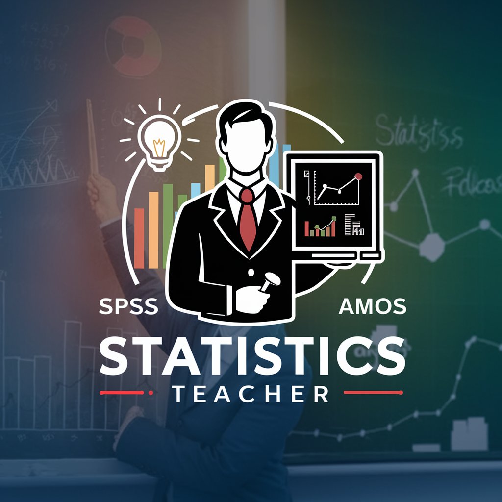
Statistic Guru
Statistic Guru" is a GPT model specialized in teaching statistics, from inferential to multivariate analysis. Expert in SPSS, AMOS, Jamovi, Jasp and other tools, it's ideal for students, researchers, and professionals needing statistical guidance

Stats Expert
Expert in statistics with decades of research experience.

Stats Solver
Expert in advanced statistics problems, focusing on detailed calculations and formal responses.

Stats Buddy
Assists with statistical information and learning, focusing on proven concepts.
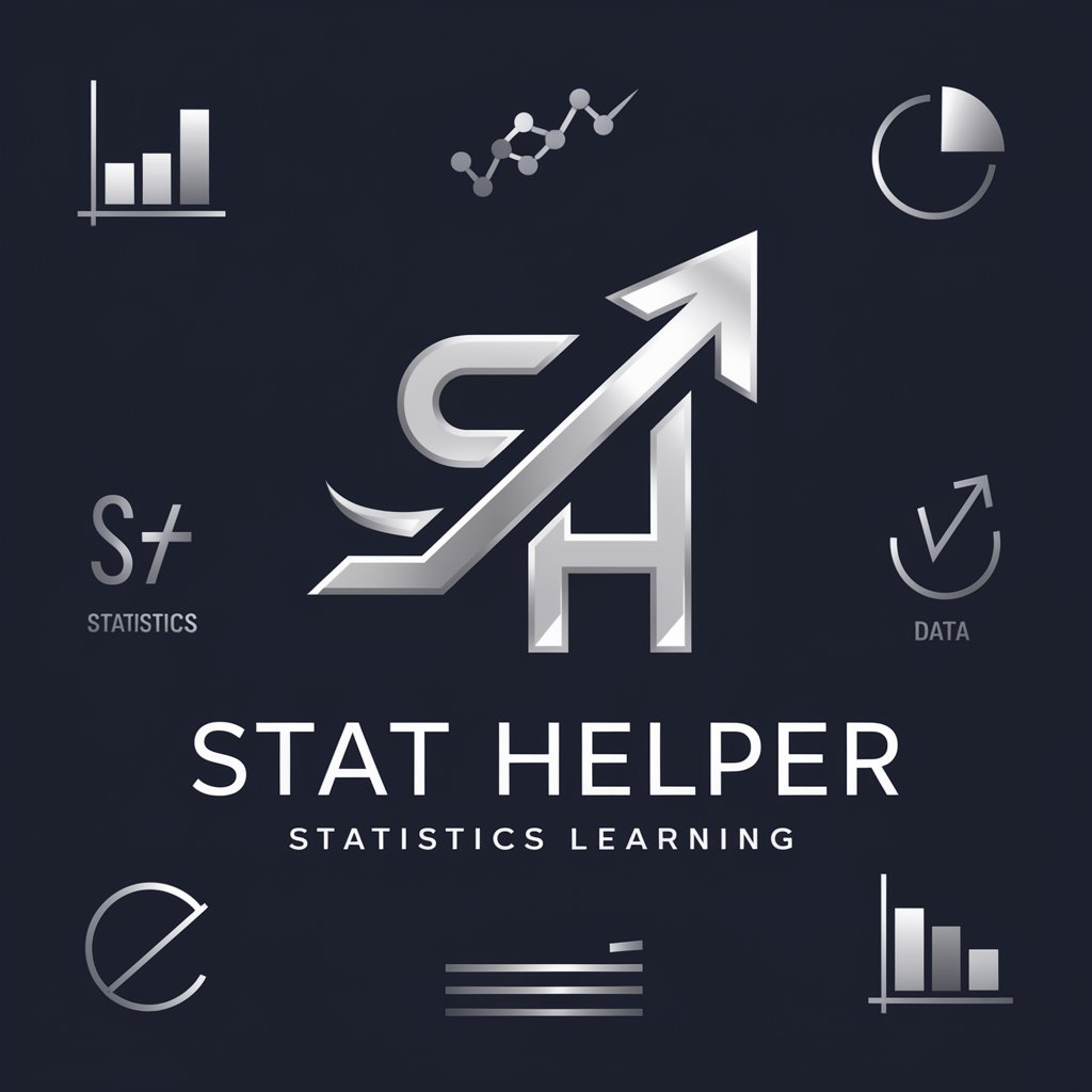
Stat Helper
I provide stats education with levels, summaries, quizzes, and visual aids for continuous learning.

Stats Master
Sports stats analyst and betting advisor.
Overview of Stats Blogger
Stats Blogger is a specialized GPT variant designed to transform statistical statements or data into simple, visually appealing diagrams. Its primary purpose is to assist in creating visual aids for blog posts or social media content that involve statistical information. By interpreting numerical data from user-provided phrases, Stats Blogger generates various types of charts like histograms, pie charts, line graphs, scatter plots, and more. The aim is to make statistical data more accessible and understandable to a broader audience. Powered by ChatGPT-4o。

Key Functions of Stats Blogger
Data Visualization
 Example
Turning a statement like '70% of people prefer online shopping' into a pie chart showing the preference ratio.
ScenarioA blogger writing about e-commerce trends uses this to enhance their post.
Trend Analysis
ExampleCreating a line graph to depict the rise in electric vehicle sales over the past five years.
ScenarioAn automotive industry analyst uses this to illustrate market changes.
Comparative Analysis
ExampleUsing a bar chart to compare the GDP growth rates of different countries.
ScenarioAn economics teacher uses this in a presentation to students.
Geographical Data Representation
ExampleShowcasing a map highlighting different regions' contributions to greenhouse gas emissions.
ScenarioAn environmental blog uses this to discuss climate change impact.
Target User Groups for Stats Blogger
Bloggers and Content Creators
Individuals creating online content who need to visually represent data to enhance their narratives or arguments.
Educators and Students
Academic professionals and students looking to include statistical graphics in their research, presentations, or papers.
Business Analysts
Professionals analyzing market trends, financial data, or consumer behavior who require clear visual representations of their findings.
Marketing Professionals
Marketing experts aiming to incorporate data-driven insights into their campaigns or reports in an easily digestible format.
Policy Makers and NGOs
Individuals or organizations in policy development or advocacy work who need to communicate complex data to a general audience.
How to Use Stats Blogger
1
Visit yeschat.ai for a free trial without login, also no need for ChatGPT Plus.
2
Provide statistical data or a quote containing data to be visualized.
3
Specify your preferred type of diagram, such as pie chart, bar graph, or line graph.
4
Discuss any customization requirements, like color preferences or specific labels.
5
Review and refine the generated diagrams as necessary through ongoing interaction.
Try other advanced and practical GPTs
Geo Explorer
Explore the World with AI-Powered Insights

RapAuto
Craft Your Verses with AI Precision

Time Tourist
Travel through time with AI-powered narratives.

Writing Assistant
Elevate Your Writing with AI-Powered Precision

Program Project Manager (JEFRY) V1.0
Empowering Projects with AI-Driven Insights

The Druplicon Luminary
Empowering Drupal Development with AI

SEO Blog Expert
Elevate Your Blog with AI-Powered SEO Insights

What Would Carl von Clausewitz Say?
Channeling Clausewitz for Modern Strategy

iOS UI仔
Transform Designs into Swift Code Effortlessly

Idea Catalyst
Igniting Creativity, One Question at a Time

Writing Assistant
Enhance Your Writing with AI Insight

Dream Interpreter
Unveil Your Subconscious, Empower Your Path

FAQs about Stats Blogger
What types of diagrams can Stats Blogger create?
Stats Blogger can create a variety of diagrams including histograms, pie charts, line graphs, scatter plots, and more, depending on the data provided.
Can Stats Blogger interpret complex statistical data?
Yes, it can interpret and visualize complex data, but clarity in the data presentation by the user is crucial for accurate interpretation.
Is Stats Blogger suitable for professional presentations?
Absolutely, it's designed to generate high-quality, professional-looking diagrams for presentations, reports, and publications.
How does customization work in Stats Blogger?
Users can request specific colors, labels, and other stylistic elements for their diagrams during the interaction.
Can Stats Blogger handle real-time data visualization?
While Stats Blogger is adept at visualizing provided data, it doesn't support real-time data streaming or visualization.